The common mistake is treating a statement plant as mere decoration; the professional approach is to use it as an architectural tool to sculpt the space.
- The plant’s scale relative to the room’s height and visual weight dictates whether it elevates or shrinks the space.
- Matching planter materials to existing furniture creates a cohesive, high-end look, not just a random pot in a corner.
Recommendation: Stop trying to ‘fill’ the corner and start creating an intentional vignette that balances the entire room’s composition.
That awkward, empty corner in your living room is a common design dilemma. The default solution for many is simple: place a large plant there. While well-intentioned, this often results in a cluttered, uninspired look that fails to deliver the desired “wow” factor. The issue isn’t the plant itself, but the lack of strategy. Home decorators often focus on the object—the plant—rather than its effect on the surrounding environment, considering basic elements like pot style or plant type in isolation.
But what if the key to transforming that space wasn’t about filling a void, but about actively sculpting it? The true power of a statement plant lies not in its decorative qualities, but in its function as an architectural element. A high-end interior stylist doesn’t just ‘place’ a plant; they use it to manipulate perception, direct the eye, define zones, and balance the visual weight of the entire room. It is a living sculpture that interacts with light, shadow, and proportion.
This guide will deconstruct the principles of using a statement plant with intention. We will move beyond the basics of “enough light” and explore the nuanced strategies of scale, material cohesion, and spatial balance. By understanding these core concepts, you can elevate a simple plant from a background object into the defining feature that anchors and transforms your interior.
To master this art, we will explore the precise techniques that separate amateur placement from professional design. This structured approach will guide you through selecting and positioning your green statement piece to achieve a truly transformative effect.
Contents: A Stylist’s Guide to Architectural Plant Placement
- Why a Small Plant on the Floor Makes Your Ceiling Look Lower?
- How to Match Planter Aesthetics With Mid-Century Modern Furniture?
- Ficus Tree or Hanging Pothos: Which Best Fills Vertical Dead Space?
- The Placement Error That Makes Your Living Room Feel Lopsided
- How to Install Grow Lights That Look Like High-End Decor Fixtures?
- Why a Small Statue Looks Ridiculous in a Large Open Lawn?
- Window vs Corner: Where Should You Place a Ficus to Avoid Draft Shock?
- Why Vibrant Biophilic Spaces Improve Mental Health in Urban Apartments?
Why a Small Plant on the Floor Makes Your Ceiling Look Lower?
The most common misstep in styling a corner is a failure to respect vertical scale. Placing a small or medium-sized plant directly on the floor draws the eye downward, creating a “stump” effect that visually compresses the room. This subconscious cue truncates the perceived height of the wall, making your ceiling feel oppressively low. A statement piece must command its space, and that includes the vertical axis. The goal is to create an uninterrupted line that guides the eye upward, enhancing the sense of openness and height.
To counteract this, the plant’s total height—including its stand or planter—must be in proportion to the wall it occupies. A plant that is too short becomes visually insignificant and clutters the floor. The solution is not always a larger plant, but rather strategic elevation. Using pedestals, minimalist stands, or even a well-placed side table lifts the plant into the viewer’s main field of vision. This creates a more deliberate and sophisticated composition. The plant is no longer just an object on the floor; it’s a vertical anchor that engages with the room’s architecture. The space between the top of the plant and the ceiling, known as negative space, becomes just as important as the plant itself, creating a sense of breathability and balance.
Ultimately, a plant’s position on the vertical plane is a decisive factor in whether it adds grandeur or creates a feeling of being cramped. It’s a game of inches that yields dramatic results.
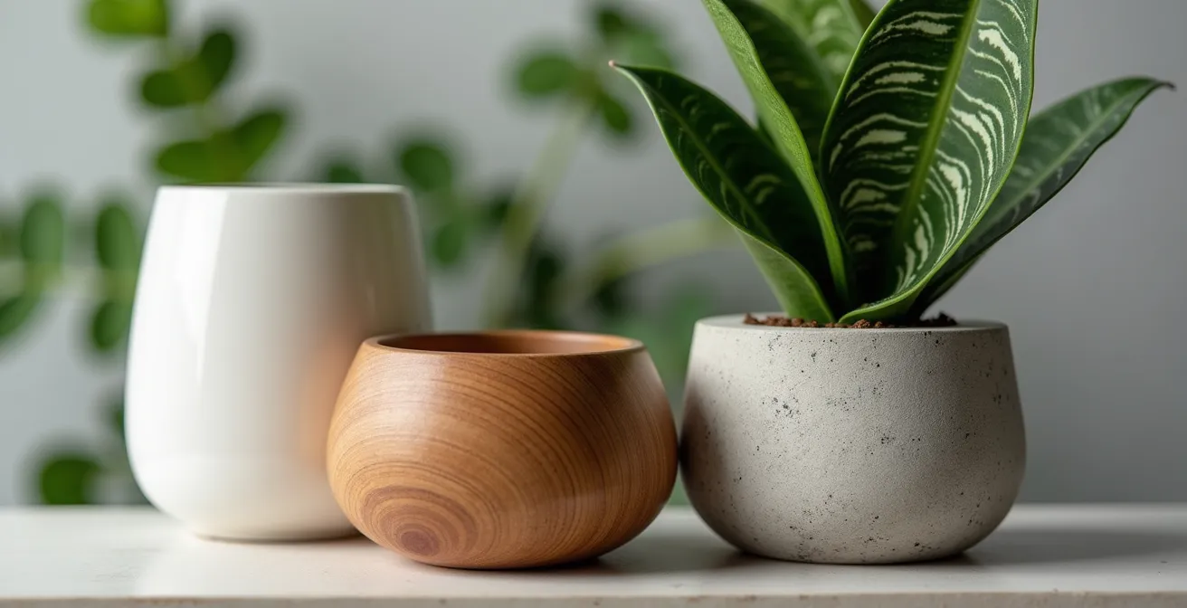
How to Match Planter Aesthetics With Mid-Century Modern Furniture?
Once you’ve mastered scale, the next layer of sophistication is material cohesion. A statement plant is only as strong as its vessel. For a style as distinct as Mid-Century Modern (MCM), the planter is not an afterthought; it is a critical component that must echo the design language of the room. MCM is defined by clean lines, organic forms, and an honest use of materials like wood, metal, and ceramics. Your planter choice must align with this ethos.
The key is “material echoing.” If your space is dominated by the warm tones of walnut or teak furniture, a planter with a wooden stand is the most seamless choice. It doesn’t just hold the plant; it becomes part of the room’s established material palette, creating a cohesive and intentionally designed look. Conversely, for an MCM interior with chrome or brass accents, a sleek metal planter—perhaps spun aluminum or powder-coated steel—can amplify that contemporary edge. The goal is to create a dialogue between the plant’s container and the existing furniture and fixtures. The texture of the planter, whether the smooth glaze of a ceramic pot or the raw finish of concrete, adds a tactile dimension that enriches the overall aesthetic. This table provides a clear guide for material selection, as detailed in a recent comparative analysis of MCM planters.
| Material | Best For | Visual Effect |
|---|---|---|
| Ceramic | Statement pieces | Clean lines, geometric shapes |
| Wood | Warm interiors | Natural, organic complement |
| Concrete | Brutalist contrast | Textural interest |
| Metal | Contemporary spaces | Sleek, elevated look |
The interplay of these material textures is where a designer’s eye becomes apparent. A matte ceramic planter next to a richly grained wooden credenza creates a sophisticated contrast that feels both deliberate and effortless.
This attention to detail ensures the statement piece feels integrated and elevated, rather than a foreign object introduced into the space. It’s about building a unified visual story where every element, down to the planter, has a purpose.
Choosing the right material is what transforms a simple potted plant into a piece of curated design that complements and enhances your existing decor.
Ficus Tree or Hanging Pothos: Which Best Fills Vertical Dead Space?
The choice of plant species is a strategic decision dictated by the specific type of “dead space” you need to address. Not all vertical space is created equal. You must decide if you are filling space from the floor up or from the ceiling down. This choice determines whether you need a plant with an upward, architectural structure or one with a cascading, draping habit.
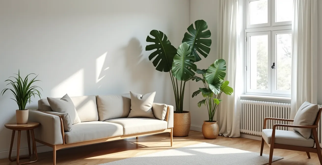
For a tall, empty corner with significant floor footprint, a Ficus tree (like a Fiddle Leaf Fig) or a large Monstera is the superior choice. These plants act as vertical columns, drawing the eye upward and creating a strong architectural presence. Their large leaves and substantial form command attention and effectively claim the space. Other tall specimens are also effective; for instance, Birds of Paradise can grow 4-6 feet tall indoors, providing significant vertical impact. They are living sculptures that define the corner with a bold, static presence. This approach is best for grounding a large room or balancing a tall piece of furniture on the opposite wall.
Conversely, if the “dead space” is higher up—above a console, in a corner with limited floor access, or along a high-ceiling sightline—a hanging Pothos or a trailing Philodendron is the answer. These plants fill space from above, with vines that can be trained along walls or allowed to cascade freely. They create a sense of organic movement and can soften hard architectural lines. A hanging plant introduces a dynamic element that creates dappled light and shadow, adding a layer of visual interest that a floor plant cannot. This is ideal for smaller apartments where floor space is at a premium or for adding life to a room without introducing another piece of furniture.
Ultimately, selecting the right plant is about diagnosing the void correctly. A Ficus provides structure from the ground up; a Pothos provides grace from the ceiling down. Choose the one that solves your specific spatial problem.
The Placement Error That Makes Your Living Room Feel Lopsided
The most sophisticated design error is to focus on the corner in isolation, forgetting it exists within a larger composition. Placing a single, massive plant in one corner without considering the rest of the room’s layout creates an imbalance of visual weight. This makes the entire room feel lopsided, as if it’s tilting toward that one heavy point. Your statement piece has inadvertently become a visual anchor that’s sinking, rather than elevating, the design.
The solution lies in the “visual triangle” method. Instead of one solitary focal point, you should aim to create a balanced asymmetry. Your large statement plant in one corner should be counterbalanced by smaller visual elements on the opposite side of the room. This could be a grouping of two smaller plants, a floor lamp, or a piece of art. These elements form the other two points of a triangle, distributing the visual load and creating a sense of intentional harmony. The eye is encouraged to move smoothly between these points, taking in the entire space rather than getting stuck in one corner. To achieve this, the main plant should also be pulled slightly away from the walls—about 12 to 18 inches—to create depth and shadow, allowing it to “breathe” and assert its three-dimensional form.
This thoughtful arrangement prevents the plant from looking like it was simply used to plug a hole. It now serves a clear compositional purpose, orchestrating the balance of the entire room.
Action Plan: Auditing Your Room’s Visual Balance
- Identify Focal Points: List all major visual elements in the room (sofa, large art, fireplace, statement plant).
- Map the Visual Weight: Sketch a simple floor plan. Do all heavy elements cluster on one side?
- Check for Triangles: Can you draw lines between three key objects to form a balanced, non-symmetrical triangle?
- Assess Negative Space: Look at the empty areas. Does the negative space feel intentional and balanced, or like forgotten gaps?
- Plan Your Adjustment: Identify where a smaller plant, lamp, or chair could be added or moved to create a counterpoint and complete a visual triangle.
By thinking in terms of triangles and balance, you move from decorating a corner to orchestrating the visual harmony of your entire living space.
How to Install Grow Lights That Look Like High-End Decor Fixtures?
The ideal corner for a statement plant is often the one with the worst light. A true stylist, however, does not compromise on aesthetics for the sake of horticulture. The solution is not a clunky, industrial grow light that screams “science experiment.” It is to integrate full-spectrum lighting so seamlessly that it becomes a part of the high-end decor itself. The light should enhance the plant and the room’s ambiance, not detract from it.
There are three primary methods for achieving this. The first is the “Invisible Light” method, which involves installing LED grow light strips under shelves, behind furniture like a credenza, or along the back of a bookcase. This provides the necessary lumens for the plant’s health while the source of the light remains hidden, creating a soft, ambient glow that appears purely decorative. It’s an excellent way to highlight the plant’s form without introducing a new fixture.
The second approach is the “Double Duty Decor” strategy. This is the simplest and often most elegant solution: replace the standard bulb in an existing, stylish fixture—like a beautiful floor lamp or an adjustable sconce already in the corner—with a full-spectrum LED grow bulb. The designer fixture retains its aesthetic function, while the bulb inside performs a horticultural one. No one will know the lamp is secretly nourishing your Ficus; they will only see a beautifully lit corner.
Finally, for a bolder statement, there is the “Art Installation” approach. Here, the grow lights themselves become a sculptural element. This involves hanging a cluster of multiple pendant grow lights at varying heights above the plant. Choose fixtures with a minimalist, modern design that complements your decor. This transforms the necessary equipment into a deliberate, artistic centerpiece that defines the corner as a major focal point.
By treating grow lights as another component of your interior design, you can ensure your statement plant thrives without ever sacrificing style.
Why a Small Statue Looks Ridiculous in a Large Open Lawn?
The principle of scale is universal. Just as a tiny sculpture is swallowed by the vastness of an open lawn, a small plant gets lost in a large, high-ceilinged room. This is the core concept of context and proportion. A statement piece is defined by its ability to hold its own within its environment. If the object is too small for its context, it doesn’t look delicate; it looks like an error, an afterthought that fails to make any impact.
This principle applies directly to indoor plants. An expansive corner with a 10-foot ceiling demands a plant of substantial visual mass, like a mature Bird of Paradise or a branching Dracaena. Placing a 3-foot-tall snake plant there, even in a beautiful pot, will only emphasize the emptiness of the space above and around it. The plant becomes visually irrelevant. The goal is to match the plant’s visual mass to the volume of the space it inhabits. The plant should feel naturally integrated, as if it belongs there, rather than being dwarfed by its surroundings.
To give a statement plant the necessary context and prevent it from looking lost, you must create a purposeful zone around it. This is about building a “vignette.” Instead of leaving the plant isolated, cluster it with other pieces of furniture. A large Ficus, for example, feels more intentional when paired with a comfortable armchair and a small side table or a reading lamp. This grouping creates a functional and aesthetic zone—a reading nook—giving the plant a clear reason for being there. Another technique is the “plinth principle,” using an elevated planter or a substantial stand to signal the plant’s importance and give it the stature it needs to command the space. Without this deliberate context, even a beautiful plant can feel like clutter.
Your statement piece cannot make a statement if it’s whispering in a cavern. Give it the scale and context it needs to speak with authority.
Window vs Corner: Where Should You Place a Ficus to Avoid Draft Shock?
While light is the primary consideration for plant health, drafts are the silent killer, especially for sensitive tropicals like Ficus. Placing a plant directly in the path of a draft—from a window, an HVAC vent, or a high-traffic doorway—can cause “draft shock,” leading to sudden leaf drop and stress. Often, the spot with the best light is also the draftiest. The amateur’s solution is to move the plant to a less-than-ideal, but safer, location. The stylist’s solution is to manipulate the environment, not surrender to it.
The first step is to become a draft detective. The “incense stick test” is a simple but effective method: light an incense stick and move it slowly around windows, doors, and vents. The trail of smoke will visibly waver or disperse where drafts are present, revealing the invisible air currents your plant will face. Don’t forget to check less obvious sources like open staircases or even skylights.
Once you’ve identified the source of the draft, the strategy is not to move the plant, but to shield it. This aligns with the decisive advice of experts. As one Interior Plant Design Expert states in the Healthy Houseplants Guide:
If the best light is in a drafty spot, don’t move the plant. Instead, place furniture as a physical barrier
– Interior Plant Design Expert, Healthy Houseplants Guide
This is a perfect example of form meeting function. Position a solid-back armchair, a decorative screen, or a console table between the draft source and your plant. This piece of furniture acts as a physical shield, deflecting the airflow while adding to the room’s composition. The plant gets the light it needs, and you’ve created a more layered, intentional design. You must also learn to read your plant’s signals; a sudden cascade of falling leaves is often the first and most dramatic sign of draft exposure.
By controlling the microenvironment, you can place your statement piece in the optimal location for visual impact without compromising its health.
Key takeaways
- A plant’s vertical scale is crucial; use stands to elevate smaller plants and prevent them from visually lowering the ceiling.
- Create a cohesive design by matching planter materials (wood, ceramic, metal) to your existing furniture aesthetic.
- Balance the room’s visual weight by using a “visual triangle,” countering a large corner plant with smaller elements on the opposite side.
Why Vibrant Biophilic Spaces Improve Mental Health in Urban Apartments?
The strategic placement of a statement plant is more than an exercise in aesthetic mastery; it is an investment in well-being. The practice of biophilic design—integrating natural elements into indoor environments—is rooted in our innate human connection to nature. In the context of a sterile or compact urban apartment, a vibrant corner of green is not just a visual anchor, but a psychological one. It serves as a personal retreat that actively improves mental health.
The benefits are tangible and scientifically supported. Research from the American Society of Interior Designers confirms that biophilic elements indoors dramatically boost perceived well-being and livability. This is because plants engage our senses in subtle but powerful ways. They reintroduce natural textures and patterns, their slow growth provides a calming sense of time, and the act of caring for them fosters a sense of purpose and connection. Beyond the psychological, there are physiological benefits; for example, certain houseplants can filter indoor air toxins according to NASA studies, tangibly improving the quality of the air we breathe.
Creating a vibrant biophilic space transforms a “dull corner” into a sanctuary. It becomes a focal point for relaxation and creativity, a pocket of living art that reduces stress and enhances focus. This corner is no longer just a well-designed part of your home; it’s an active contributor to a healthier, more balanced state of mind. The “wow” factor you achieve is not just visual—it’s visceral. It’s the profound sense of calm and vitality that comes from living with nature, even within the confines of a city apartment.
Therefore, begin by re-evaluating that dull corner not as a problem to be solved, but as an opportunity to cultivate a space that is not only beautiful but also restorative.